Posters
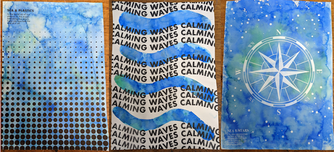
Once I had decided on the possible subjects I could do for my Masters, we needed to create a set of three posters to describe the possible areas we could go in. Because I had one overarching area that cemented the possible areas, that being the sea, I decided that for each of the posters the background or main colour used should be a blue for the sea. I didn't just want to have the backgrounds be just one blue colour, instead I wanted to create a gradient of blues and greens as these would represent the sea better. Along with this because I wanted to create these posters by hand, using the computer very little, I decided to make the background using a technique where you take tissue paper and wet it on the paper with a sponge then the ink will seep through onto the paper and create this really interesting and sea like texture that works really well for what I wanted it for.


Comments
Post a Comment